Mixed reactions to Ontario Conservatives’ new logo
The new logo of the Ontario Progressive Conservative party, unveiled at a party convention last Saturday.
BELLEVILLE – There are mixed reviews on the Ontario Progressive Conservative Party‘s new logo, revealed at its annual general meeting this past weekend in Ottawa.
Before a large group at the Shaw Centre Saturday, party leader Patrick Brown said of the logo that “there is one thing that (Premier) Kathleen Wynne fears more than anything else: a Progressive Conservative party that has the courage to change.”
The previous logo of the Ontario Progressive Conservatives.
And that is exactly what the party is hoping for with the new branding. But the reaction had ranged from strongly positive to very negative.
Students at Loyalist College also had mixed reactions.
“It’s confusing, because I can’t tell which party it’s for, because it has all of the colours,” said student Joel Perry.
“I can’t figure out if I even like it or not, or understand it now. It’s too confusing,” Perry said.
Meanwhile, student Megan Lotte, 21, said she likes the newly designed logo.
“It’s the first creativity I’ve ever seen from the party. I love it. I definitely agree with what they’re doing, ” said Lotte.
The new logo is not just an attempt by the party to get publicity. Political parties tend to change their logo and “look” every few years as a branding technique.
The Ontario PCs say the new logo – a red P mixed with a blue C and a stylized green trillium in the middle – stands for “inclusion, renewal, openness and change.”
The party has changed its logo every three to five years. The Ontario Liberal Party has changed its logo every five to 10 years.
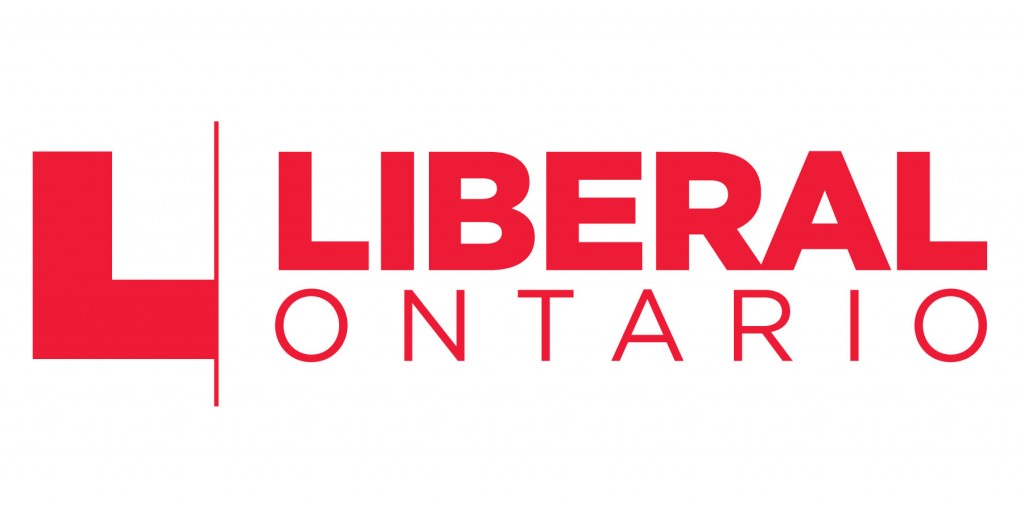
The current logo of the Ontario Liberals.
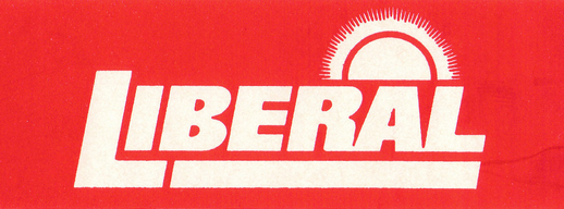
The Ontario Liberals’ logo was once a bright red box around the word “Liberal” with a sun on top, back in 1985.
Since then, the provincial Liberals have changed their logo four times. The Ontario PCs have changed theirs eight times in the same period.
The Liberals are planning to display a new look and logo at their annual convention this summer, with the date and location still to be announced.
 Print This Post